Member content

Already a member? Sign in below
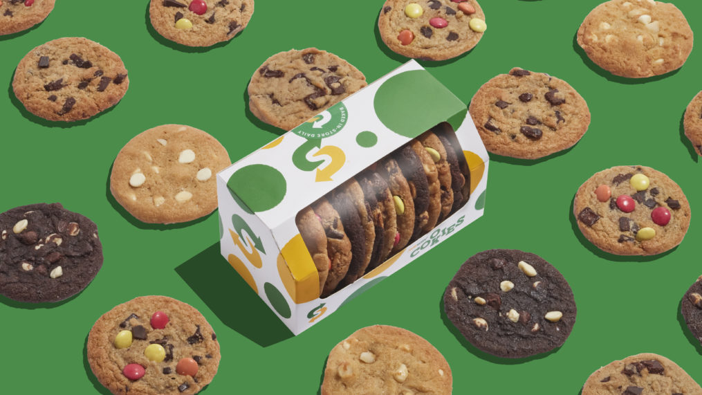
Subway is rebranding its classic cookie sweet snack product across EMEA with a new design created by its agency Above+Beyond. The new EMEA Subway Cookies identity takes traditional patterns and typography to give the product a joyful and colourful look.
Above+Beyond’s work on the new identity started with creating a typographic “COOKIES” logo-marque. The agency used Subway’s house typeface and gave it a slab treatment – reminiscent of ‘50s American diners famous for all things sweet, nostalgic, and comforting. It then took the letterforms and laid them out like cookies on a tray with a loose and fun arrangement, applying a rough “baked” texture to the edges of the marque.
This idea of bringing the freshly baked story to life extends through to a playful polka dot pattern used across packaging and beyond. Like the cookies themselves, each circle is completely unique in shape, size, and edges, allowing Above+Beyond to create bespoke patterned environments for different elements to live in.
For the packaging itself the logo and pattern, including the Subway choice mark, have been carefully woven together. In keeping with the iconic green and yellow Subway colourway, the branding is strikingly simple and instantly recognisable to ensure consistency across 14 different markets in the EMEA region.
Tom Munckton, Creative Director of Design & Branding at Above+Beyond said: “As the cookies have always been such a key part of a Subway guests’ experience, it was important to create an identity that was as memorable, and joyous, as the fast-food cult-classic itself.”
Already a member? Sign in below
If your company is already a member, register your email address now to be able to access our exclusive member-only content.
If your company would like to become a member, please visit our Front Foot page for more details.
Enter your email address to receive a link to reset your password
Your password needs to be at least seven characters. Mixing upper and lower case, numbers and symbols like ! " ? $ % ^ & ) will make it stronger.
If your company is already a member, register your account now to be able to access our exclusive member-only content.